The brief
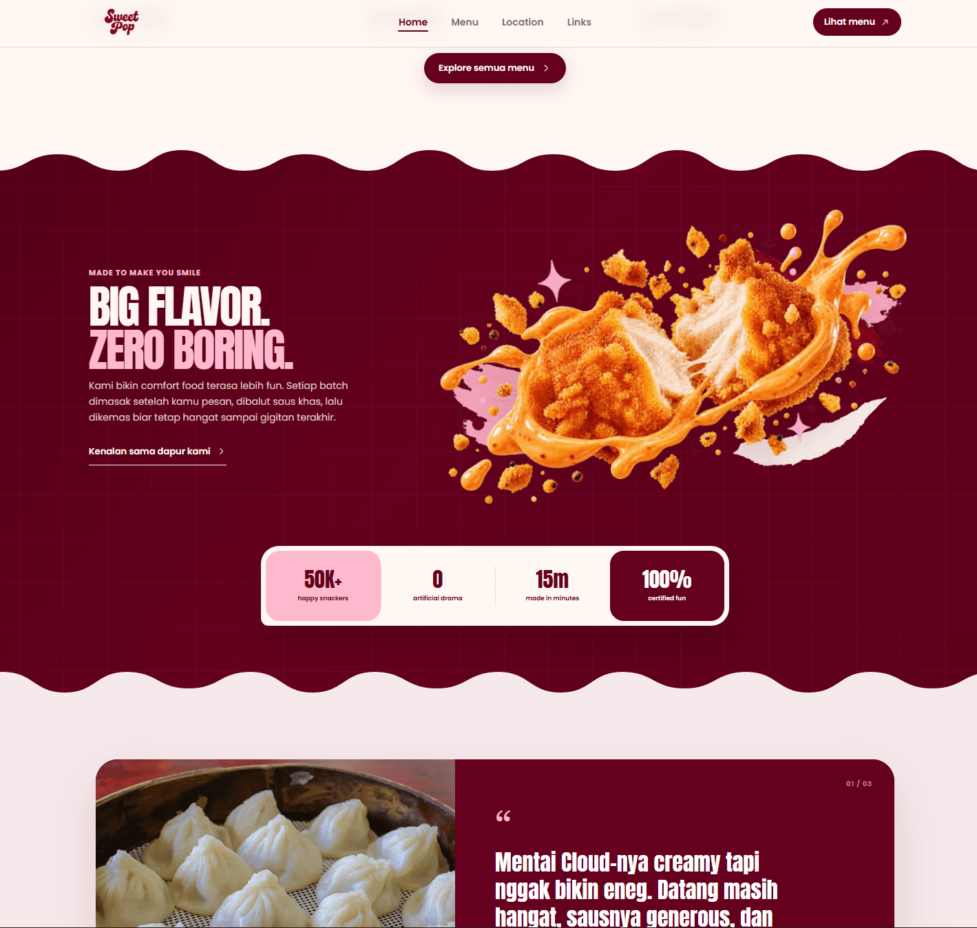
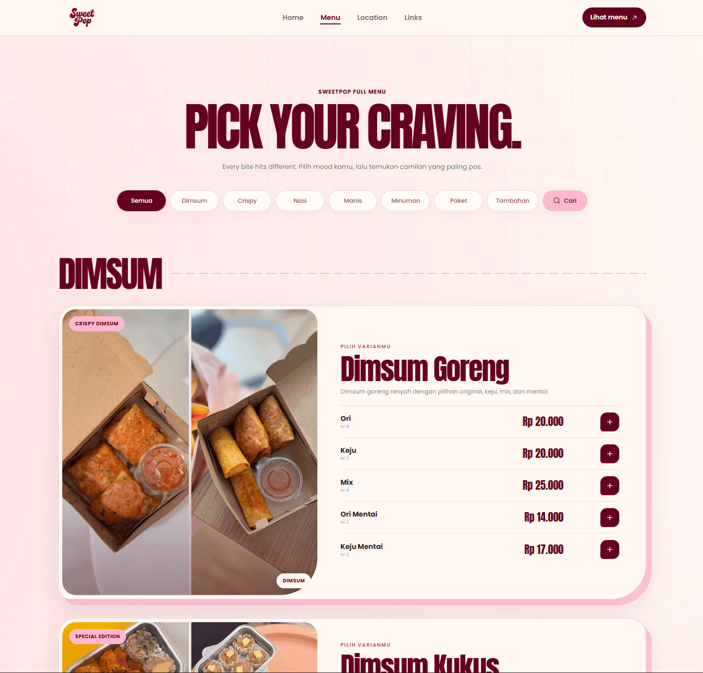
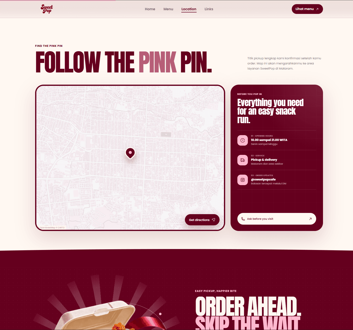
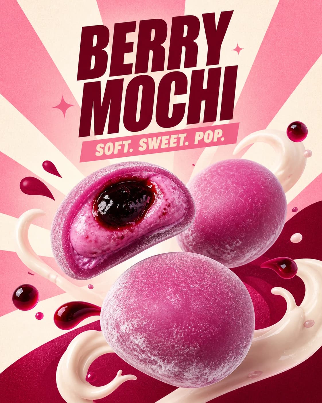
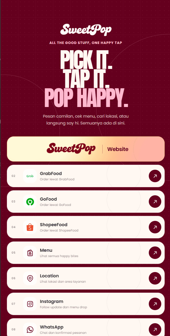
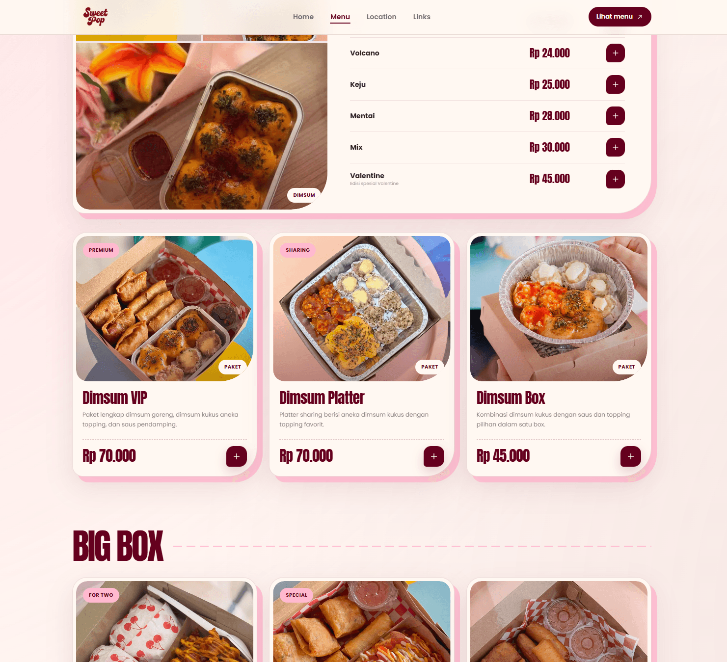
The brand had a wide, visually expressive menu, but that energy could quickly become noisy on a small screen. The experience had to stay playful without hiding categories, pricing, location details, or the next ordering action.
Food brand & ordering website
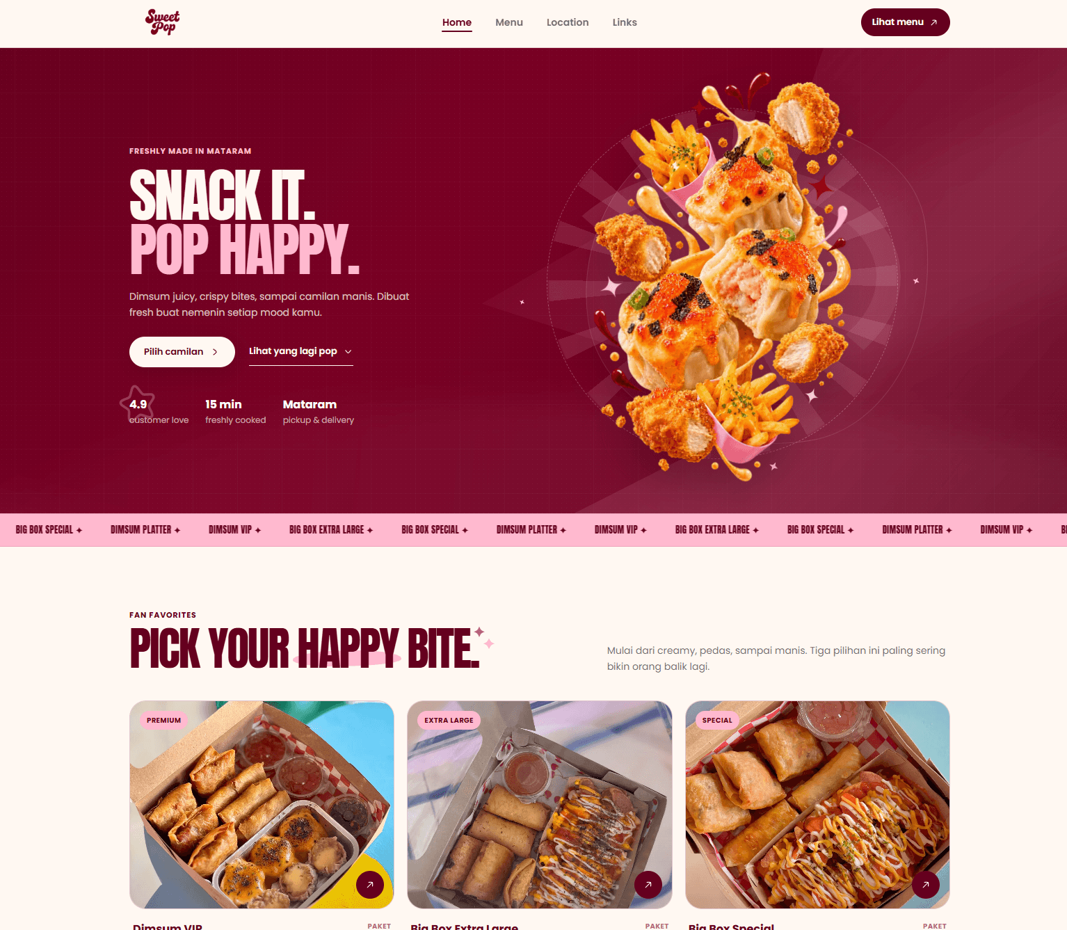
A bold food website that turns SweetPop’s playful identity into a clear menu and ordering journey.
Project frame
A bold food website that turns SweetPop’s playful identity into a clear menu and ordering journey.
The brand had a wide, visually expressive menu, but that energy could quickly become noisy on a small screen. The experience had to stay playful without hiding categories, pricing, location details, or the next ordering action.
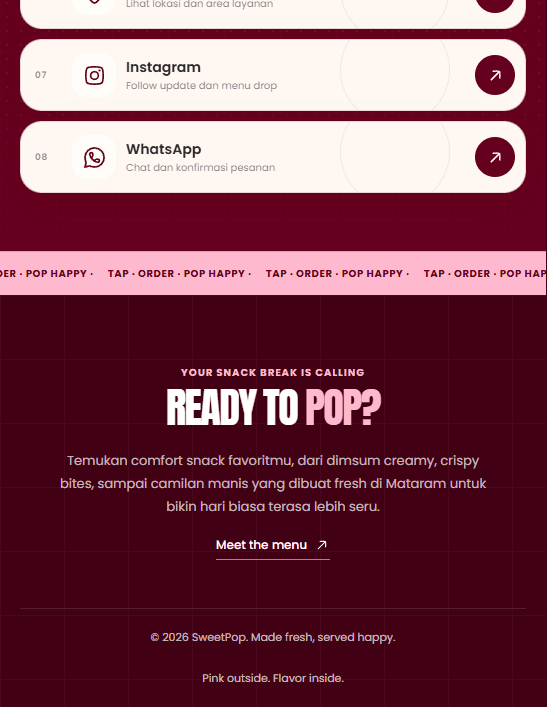
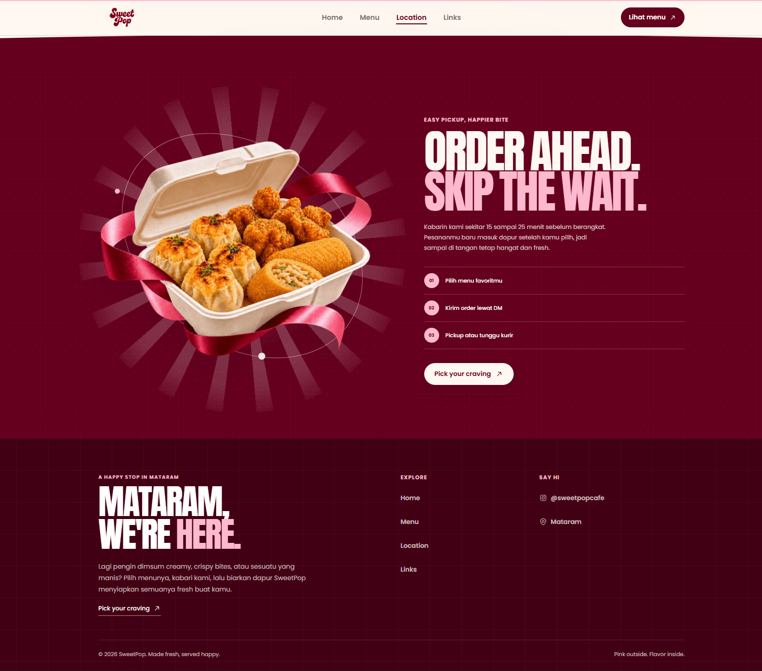
We built a responsive brand system around oversized typography, rich food art, clear category filters, and a persistent order flow. Menu selections are translated into a structured WhatsApp message, while dedicated location and link pages keep every customer path connected.
SweetPop needed a digital home that felt as energetic as the food itself while making it effortless for customers in Mataram to discover products, understand availability, and move into an order.
Selected deliverables
Visual sequence
A closer look at the screens, interactions, and product moments that shape the complete experience.